Publications differ from advertisements in one important way: they remain. An ad may circulate for a season; an article settles into libraries, databases, and citation lists. The five publications presented here relate—directly or indirectly—to graphic design, typography, multimedia, and virtual environments. In each case, my contribution was less about decoration and more about structure: how information is shaped, framed, and made legible.
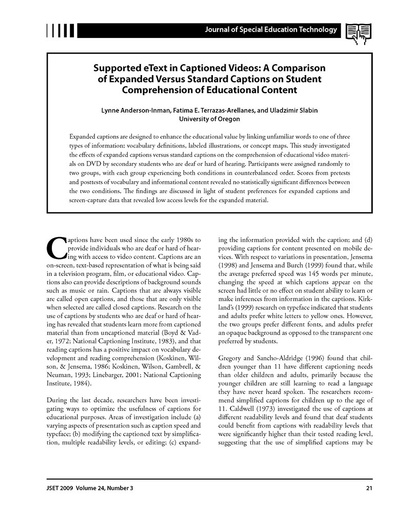
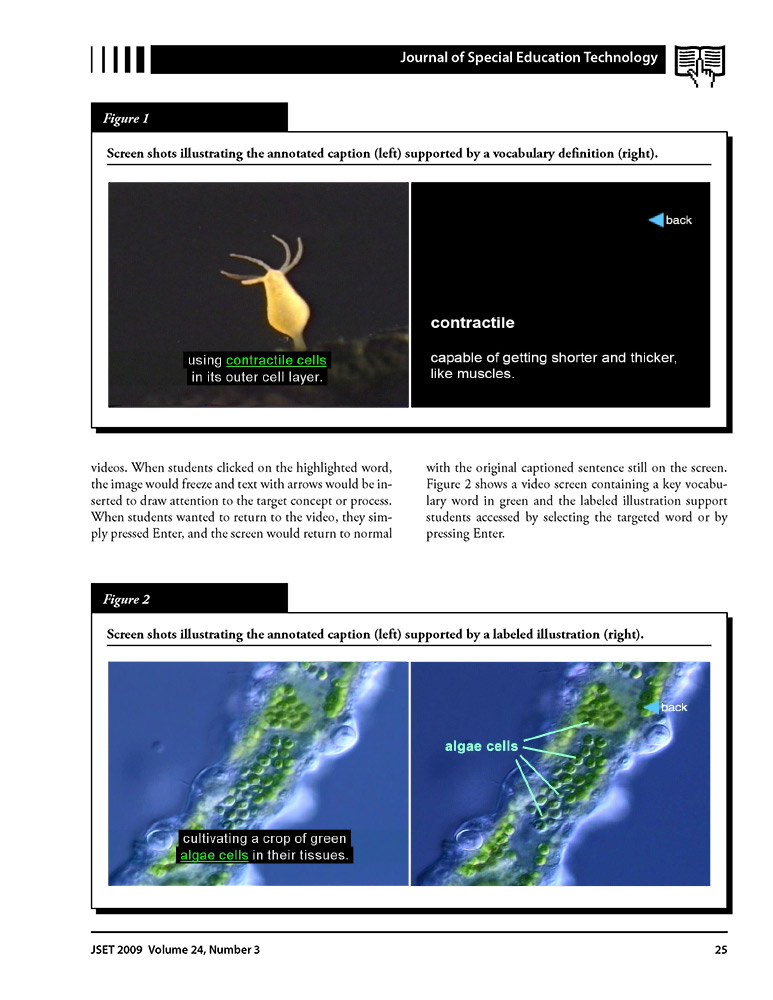
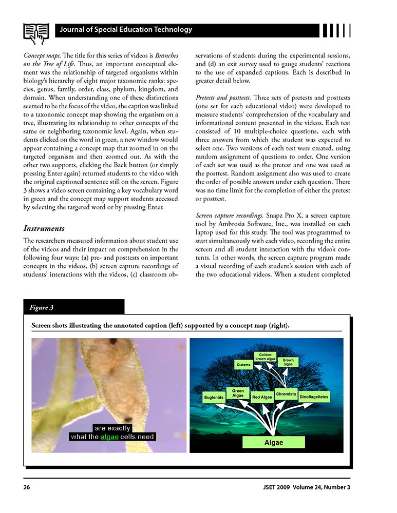
In this publication, my role in this collaborative research was to design the expanded (annotated) captions used in educational videos. These were not merely subtitles, but layered textual supports intended to clarify terminology and reinforce learning. The study demonstrated that such captions were more effective than standard ones—a rare and satisfying moment when typography could be measured, not just admired.
Anderson-Inman, L., Terrazas, F., & Slabin, U. (2009). Supported eText in captioned videos: A comparison of expanded versus standard captions on student comprehension of educational content. Journal of Special Education Technology, 24(3), 21–34. https://doi.org/10.1177/016264340902400303
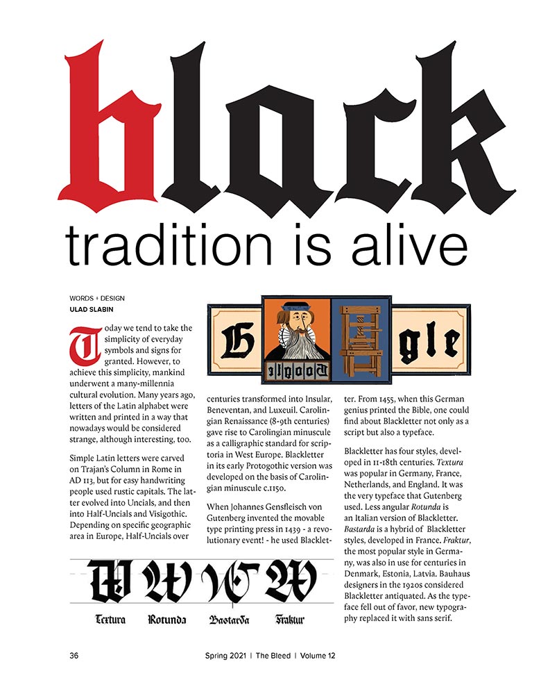
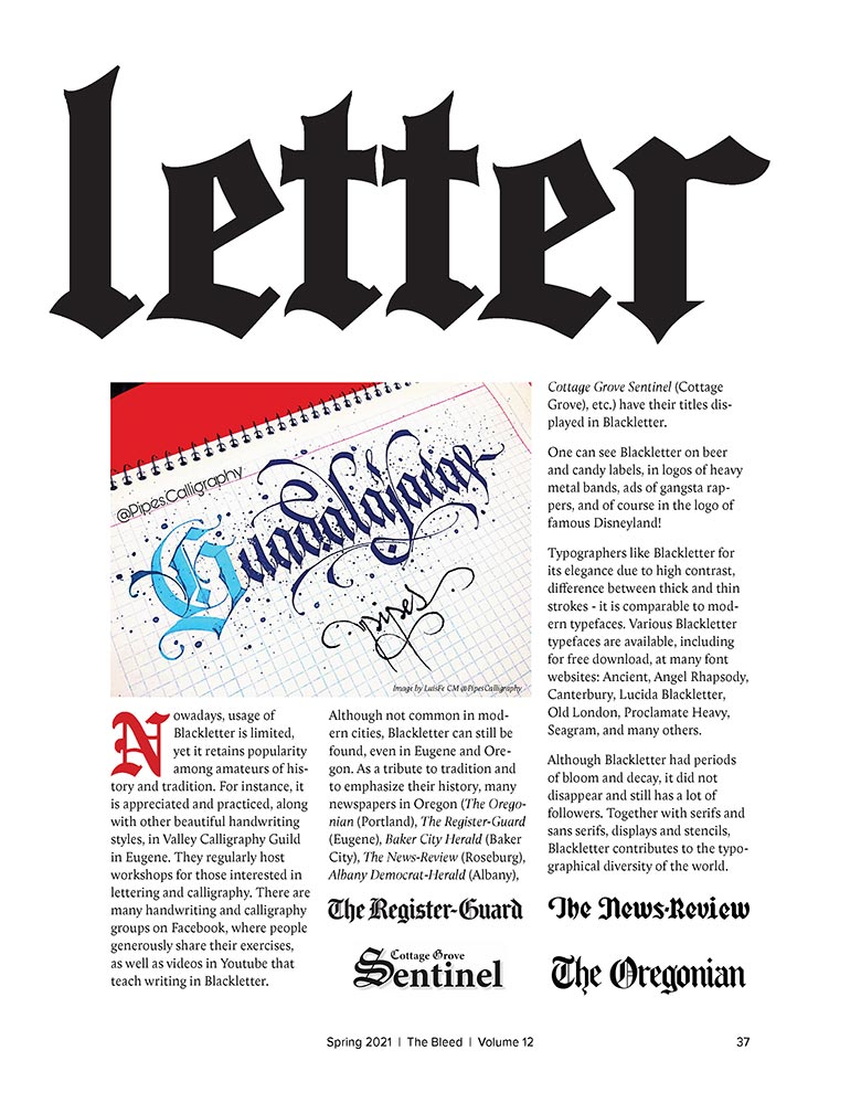
This was a typographic mini-research project conducted independently. I examined the presence of blackletter in Oregon press and signage, and the publication itself became part of the argument: title set in blackletter, text carefully structured, illustrations developed to echo historical forms. Everything—from headline to ornament—was mine. Tradition, it turns out, is not fragile; it simply needs thoughtful context.
Slabin, U. (2021, May). Blackletter: Tradition is alive. The Bleed, 12, 36–37.
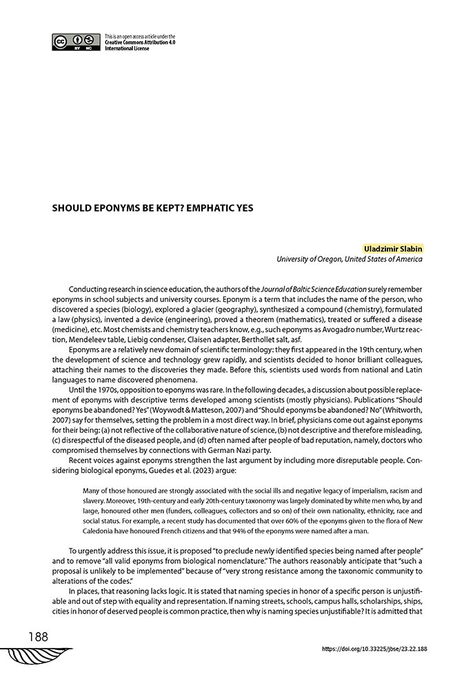
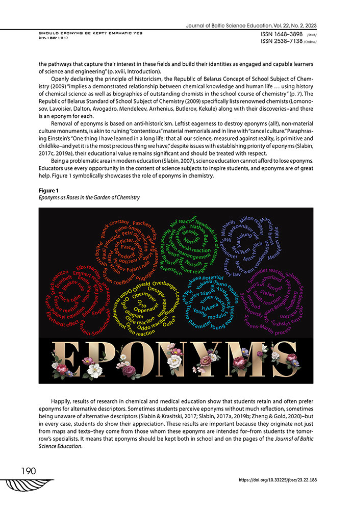
This was primarily an essay, but it includes an illustration I developed in Adobe Illustrator specifically for the piece. The visual component carries the rhetorical weight. (Thanks are due to the designer of the typeface used in the illustration—credit and link provided alongside the work.)
Slabin, U. (2023). Should eponyms be kept? Emphatic yes. Journal of Baltic Science Education, 22(2), 188–191. https://doi.org/10.33225/jbse/23.22.188
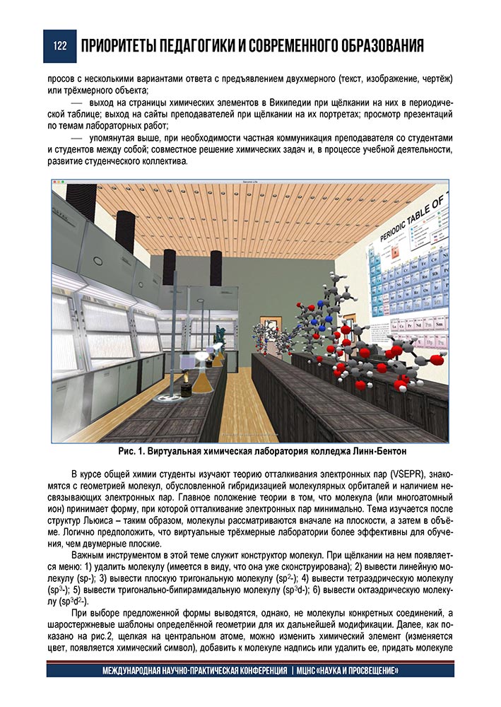
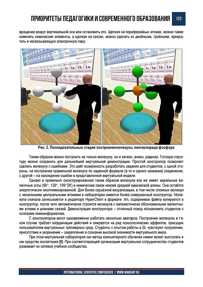
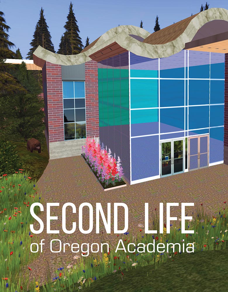
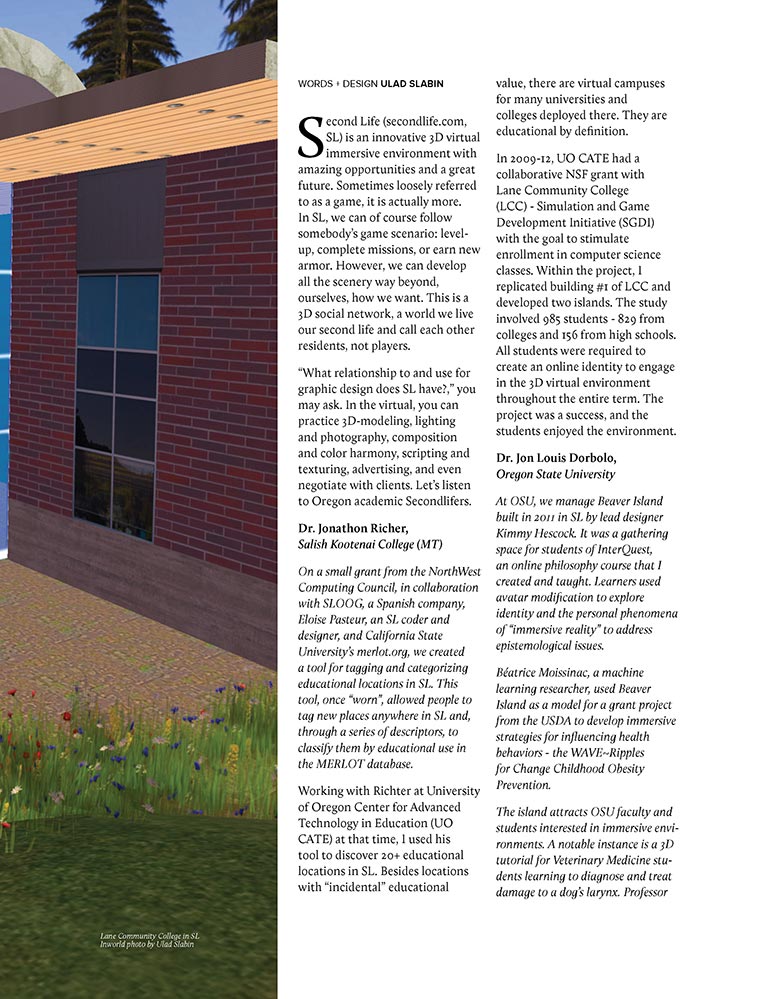
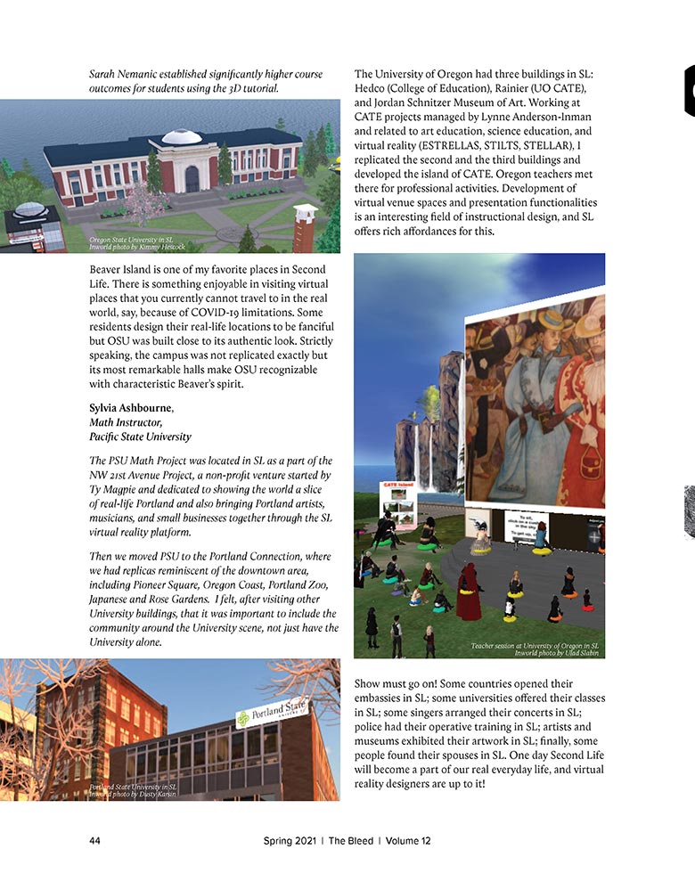
Two publications below document my long-standing engagement with the virtual environment Second Life. In the former, colleagues and I reflected on the platform’s academic history, illustrated with photographs taken inworld. I also built the featured Lane Community College structure that appears there. Earlier, in the latter publication, I presented the use of Second Life for chemistry education—again documenting spaces I designed and constructed myself - a general chemistry laboratory of Linn-Benton Community College. Re-designing a real laboratory as virtual is still design; gravity is optional, but structure is not.
Slabin, U. (2021, May). Second Life of Oregon academia. The Bleed, 12, 42–44.
Slabin, U. (2018). Building molecules in a virtual laboratory. In Priorities of Pedagogy and Contemporary Education. [In Russian] Collected articles of International Scientific Conference, Penza. 120–124.